
Purely Elizabeth is one of those rare projects whose brand identity Jen Stern created from the moment the client realized her healthy baking mixes might actually be something people would want to buy. In the early days of both 452 and Purely, Jen developed the brand’s entire look and feel before the first package was produced — and well before the now-famous granola was even conceptualized and became the next phase of Purely branding.
From the logo and color palette to all packaging and foundational brand style, we established a visual language that continues to define the brand today. We helped shape a presence that remains undeniably consistent through years of growth — and had a blast while doing it.
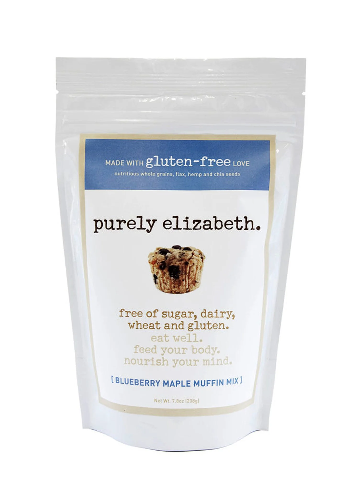
From hand-applied labels (2009) to packaging on shelves nationwide... here is the early evolution of a brand that quickly became a national household name.
Purely Elizabeth
Branding:
Logo
Packaging
Website
You name it ...
Over the years, we also designed everything from merchandise and trade show displays to stationery and ads — but we’ll spare you the full archive and give you an overview of the birth of the Purely brand!
Year
2009 → →

ORIGINAL Purely Logo / 2009
ORIGINAL Purely LABELS (before packaging!) - baking mixes / 2009

Bags Become Boxes / 2011

Labels Become Packages/ 2010


The press that made Purely explode! / 2009
Still bags with labels glued on!

Original Purely Site - Introducing Cookie Mixes / 2010


First Full Ecommerce Site / 2014
Business Cards / Refined Logo / 2011


Boxes Have Babies / Minis / 2012