
PURELY ELIZABETH
BRAND EVOLUTION
Created in 2009, sold for $850 million in 2026.
Good design doesn't just work. It's what makes people look in the first place. It sells.
entire purely elizabeth branding
from day one
by 452 Design Studio / Philadelphia / 2006–2015
Almost 17 years ago, Elizabeth Stein asked me to design stickers for baking mixes. To stick onto plastic bags in her apartment.
It was the earlier days of my studio, 452 Design. I had never designed for food before. I don't design to an industry — I design for the person and the product or service in front of me.
So I designed her brand with bold color, clean typography, and real white space. Warm enough to say healthy. Minimal enough to draw people in. Bold enough to be fun at the same time.
No natural food packaging looked like it. It popped.
People loved her baked goods, so she took them to trade shows.
And she told me the same thing every time — people came to the booth because of the design.
Then they tasted what she made, and loved it.
From day one and for years after, I kept building it out — logo, business cards, trade show booths, branded stickers for packaging at first, then the actual packaging, the website, signage, apparel, you name it. Every flavor change. Every packaging change — boxes, bags, minis…
Seventeen years later, the brand DNA that I created from day one still pops — now in the aisles of more than 30,000 stores.
And this week, Liz sold Purely Elizabeth to Ferrero — the Nutella company, which now owns Kellogg's cereal too — for $850 million.
Good design doesn't just work. It's what makes people look in the first place. It sells. It lasts.
Liz is the reason this happened. Brilliant, relentless, hardworking, strong — a beautiful person inside and out, and one of the most special people I have ever known.
I just made sure people stopped long enough to find out what I already knew.
Good design helps businesses grow. Period.
2007
Before there was even a thought of a brand
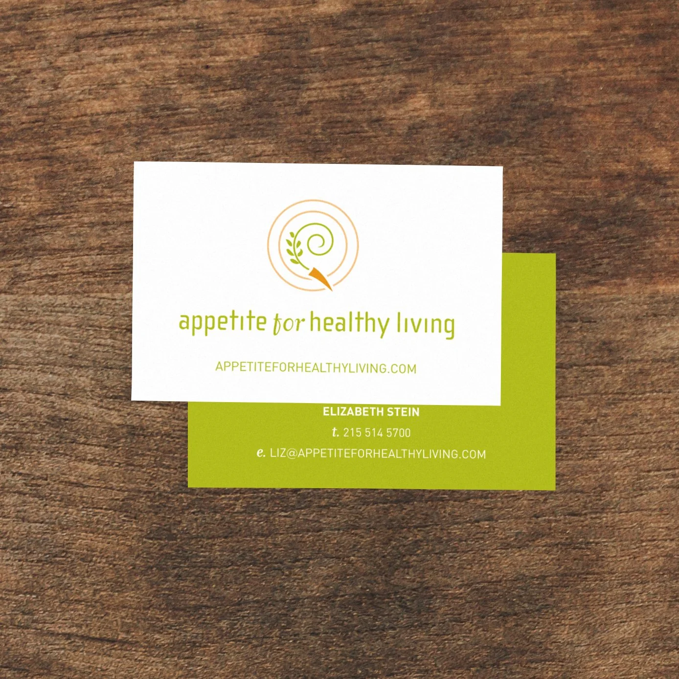
Before there was a brand, there was a consultant. In 2007 Elizabeth Stein left marketing, trained as a holistic nutrition counselor, and started coaching clients one-on-one and teaching cooking classes. She needed a card for her business, Appetite for Healthy Living. That's the first thing I ever designed for her. Baking mixes weren’t even in the discussion – much less granola.
January 2009
“Here’s what I came up with, Jen.”
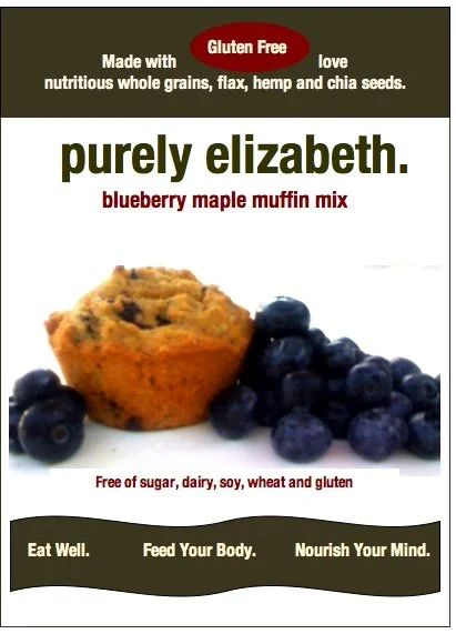
To Liz’s defense, this looked pretty good for someone who was not a designer but had a vision. And I always love seeing what clients are envisioning for their brand, from online inspiration to a simple sketch.
So, with this and through our many discussions of her product and her mission, of what she was selling and why people would love it, I was able to use this as… a starting point…?
But her idea was brilliant and exciting. And I was so ready to jump in.
Design draft from client:
April 2009
Elizabeth has an idea. I start work on her logo.
Elizabeth was running marathons and couldn't find anything worth eating afterward. So she started making her own — muffin and pancake mixes built on nutritious whole grains, flax, hemp and chia seeds., the kind of thing you'd actually want at mile twenty and could still feel good about at breakfast.
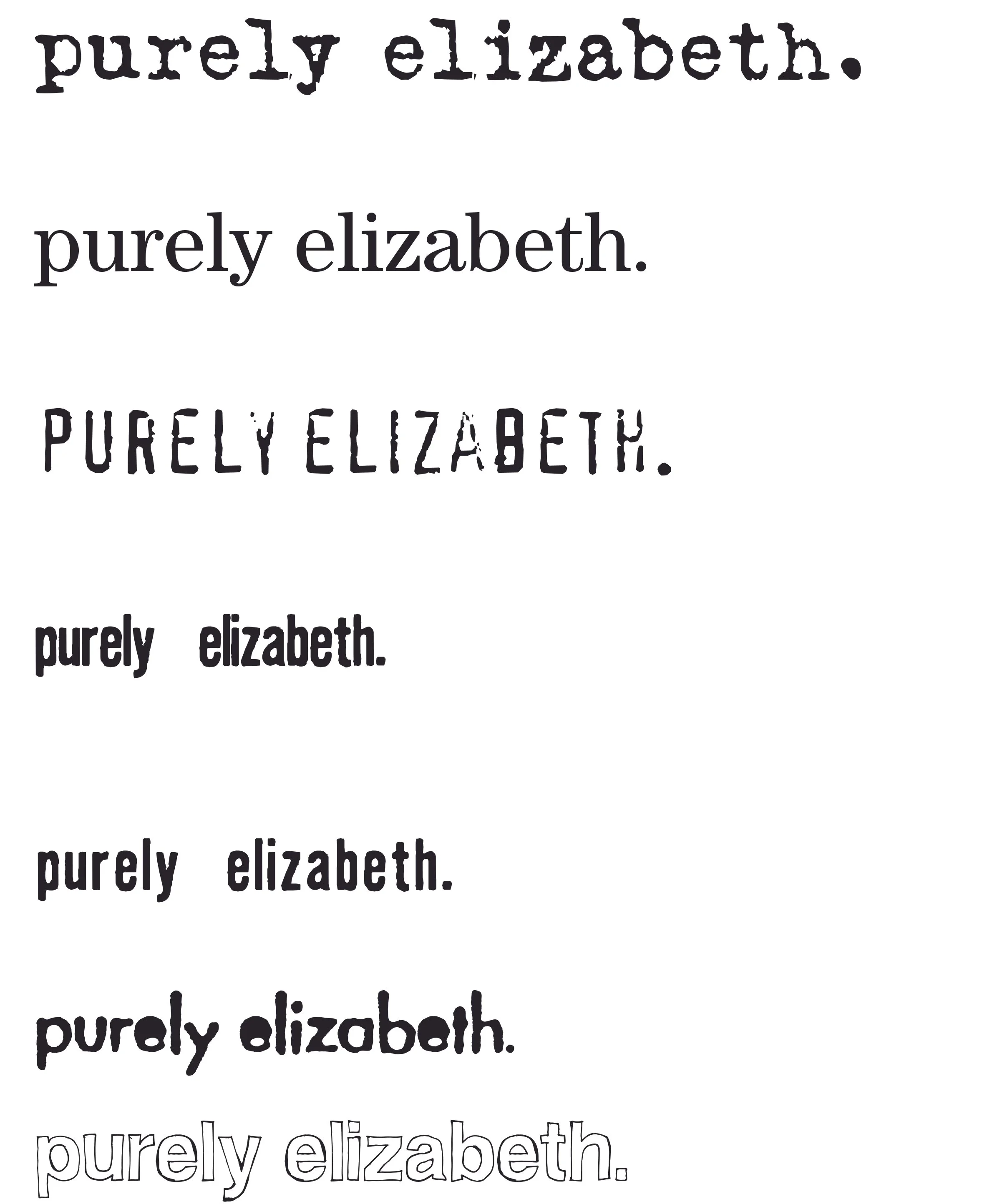
She wanted to sell them at races. A table, a stack of bags, other runners. She decided that Purely Elizabeth would be the name of this baking-mix company. She wanted a logo first - remember, these were just for stickers on plastic bags, so the branding process was not my typical, comprehensive one – and she wanted a logo that looked professional but organic - not hand-written but not corporate. So I played with typefaces – which were much more difficult to come across in 2009.
That's who the brand was for, long before there was a brand. Everything I designed came out of that – It had to look like a person made it, because a person did.
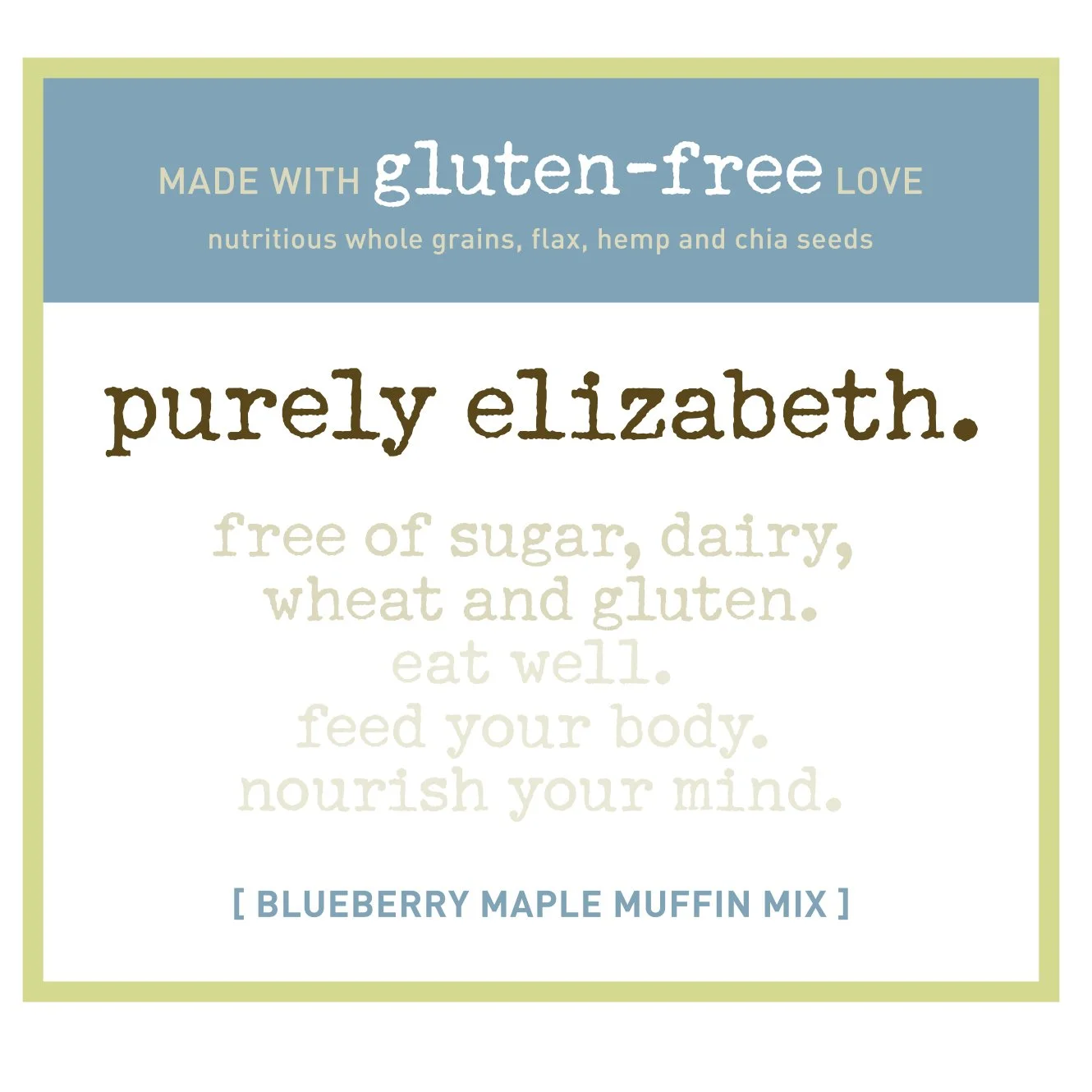
August 2009
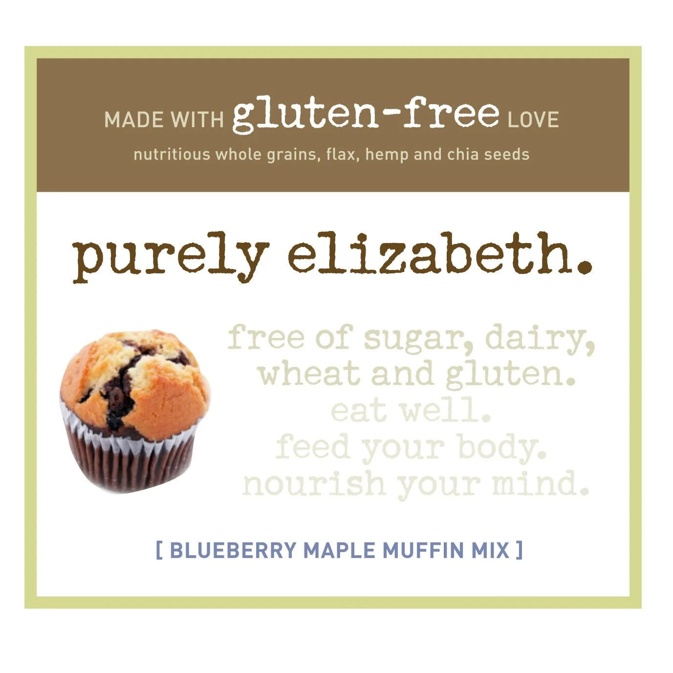
The very first labels
Liz knew what she wanted to say - and she wanted to say it big - loud and clear. She was ahead of her time. There wasn’t anything like it. So we didn’t want it to LOOK like anything else.
During the original design process – yes, for sticker designs on kraft bags – we discussed various options of using photography vs. not, as well as how we were going to color-code each flavor - with type only, keeping the packaging more brown and organic, or really going for the flavor and making the color more the star of the show.
September 2009
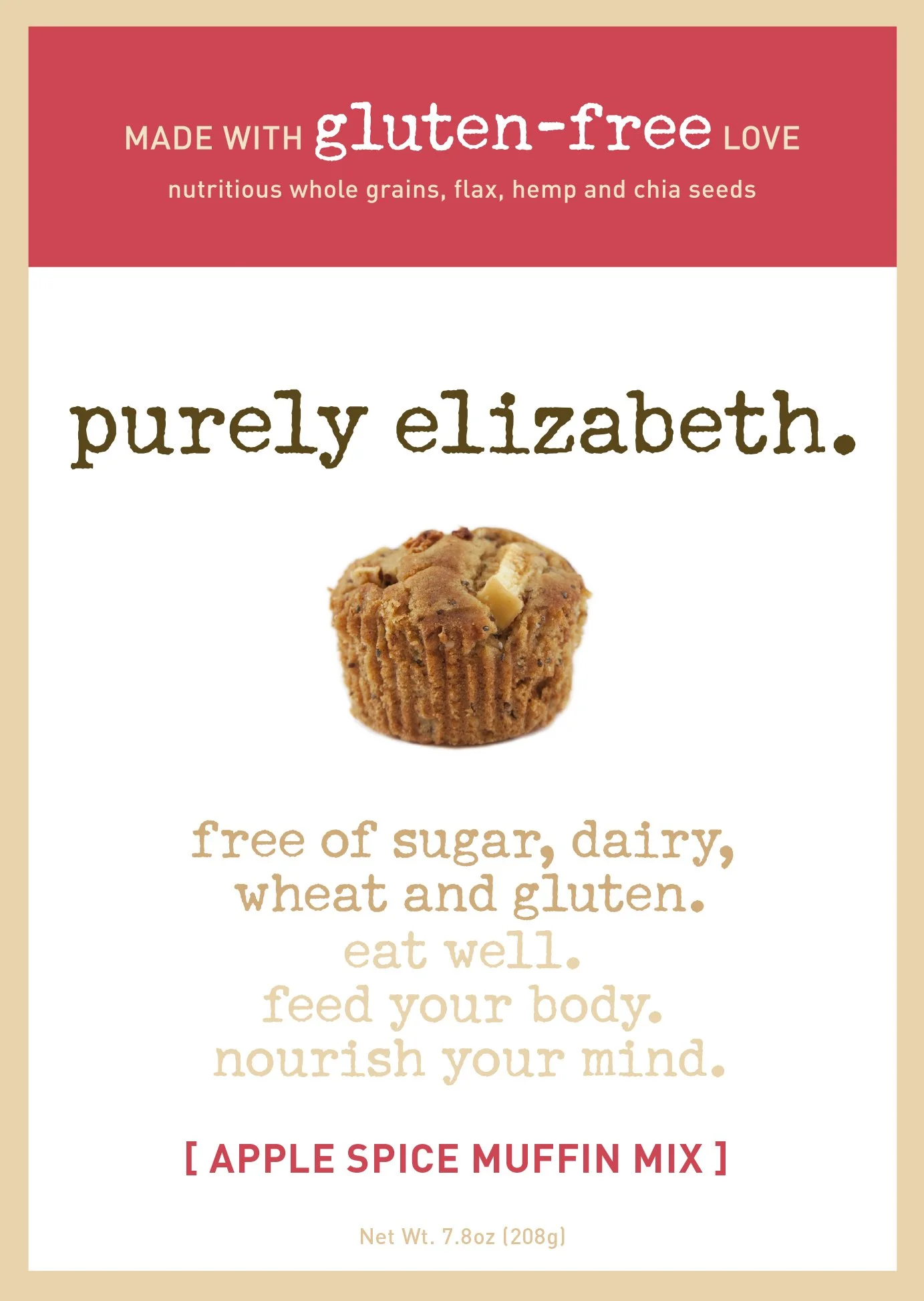
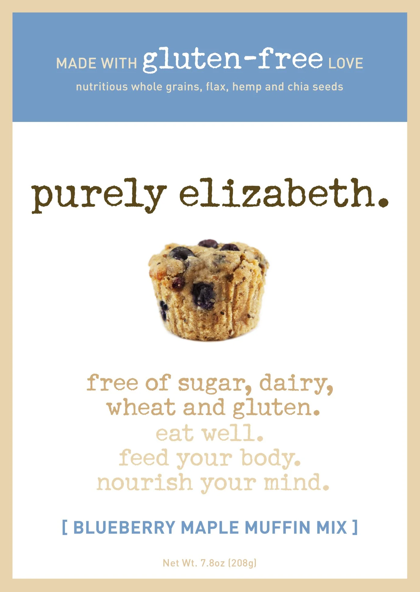
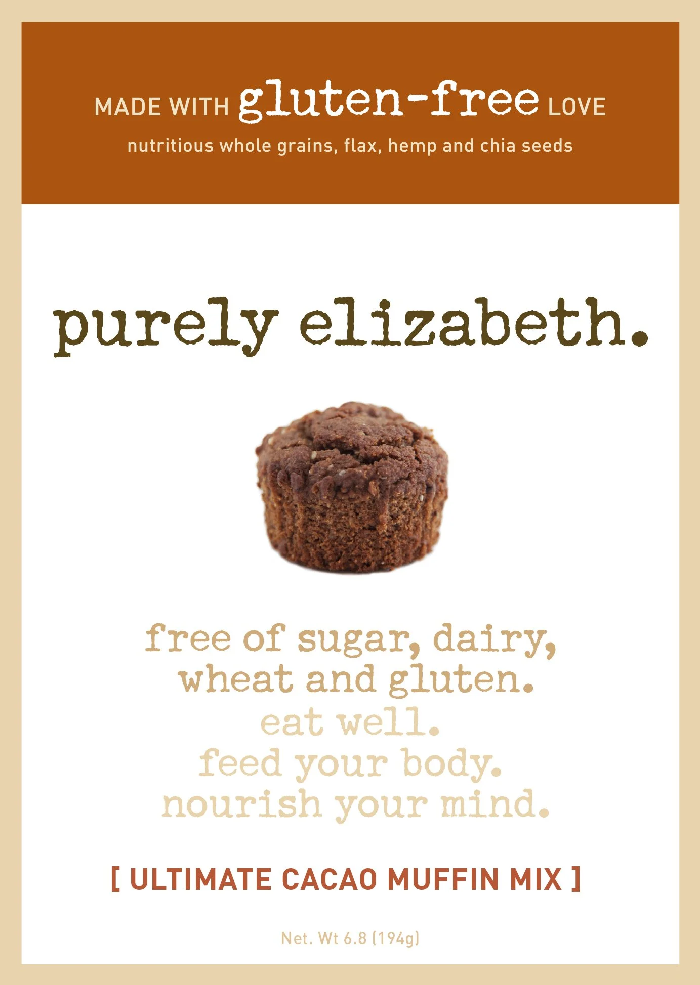
The very first real Purely Elizabeth packaging labels – which were for muffin mixes – years before granola!
We agreed that we could focus on color to emphasize the amazing taste of her products, while maintaining accent colors and font choices that still clearly conveyed what she was trying to say. I pushed hard for minimalism and color blocking, to differentiate her even more from the competitors, and I was so grateful that she trusted me. I just knew that her product was different, and I just knew that I wanted to redefine natural foods packaging for her.
The white space gave people room to breathe on shelves cluttered with words.
We also agreed that the product should be on the packaging. It made me laugh when I recently read this quote by Jason Feifer (no offense to him!!) of Entrepreneur magazine:
What stands out on shelves? It’s the food that looks most delicious. In granola… Does a window in the bag do that? Not really. Granola is... granola. But a big, beautiful photo does — and because competitors all had windows, photography would pop off the shelves.
The truth is that the packaging included photos when Liz was actually taking photos, herself, and printing stickers for kraft bags!!!
There was a lapse in time where she was advised to try the windows. It happens.
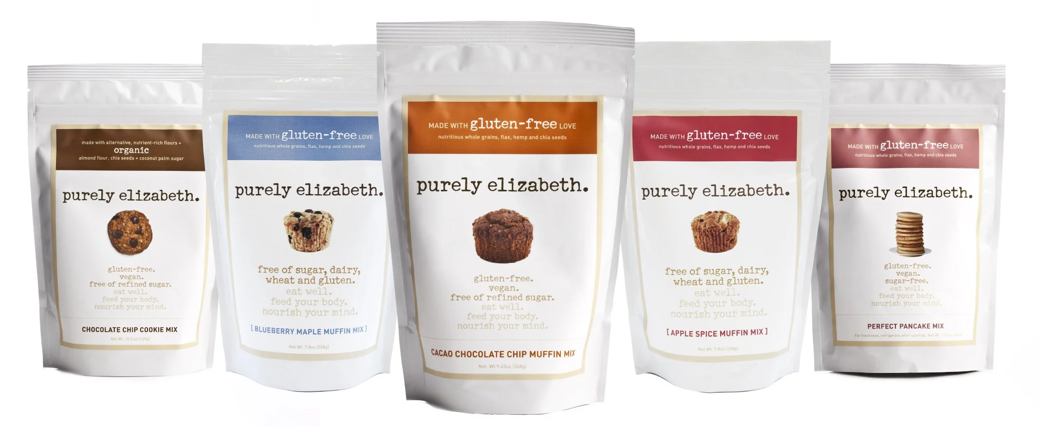
August 2010
The label system matures.
Now it was time for the real deal: packaging with labels already on it!
And more products are added,
October 2010
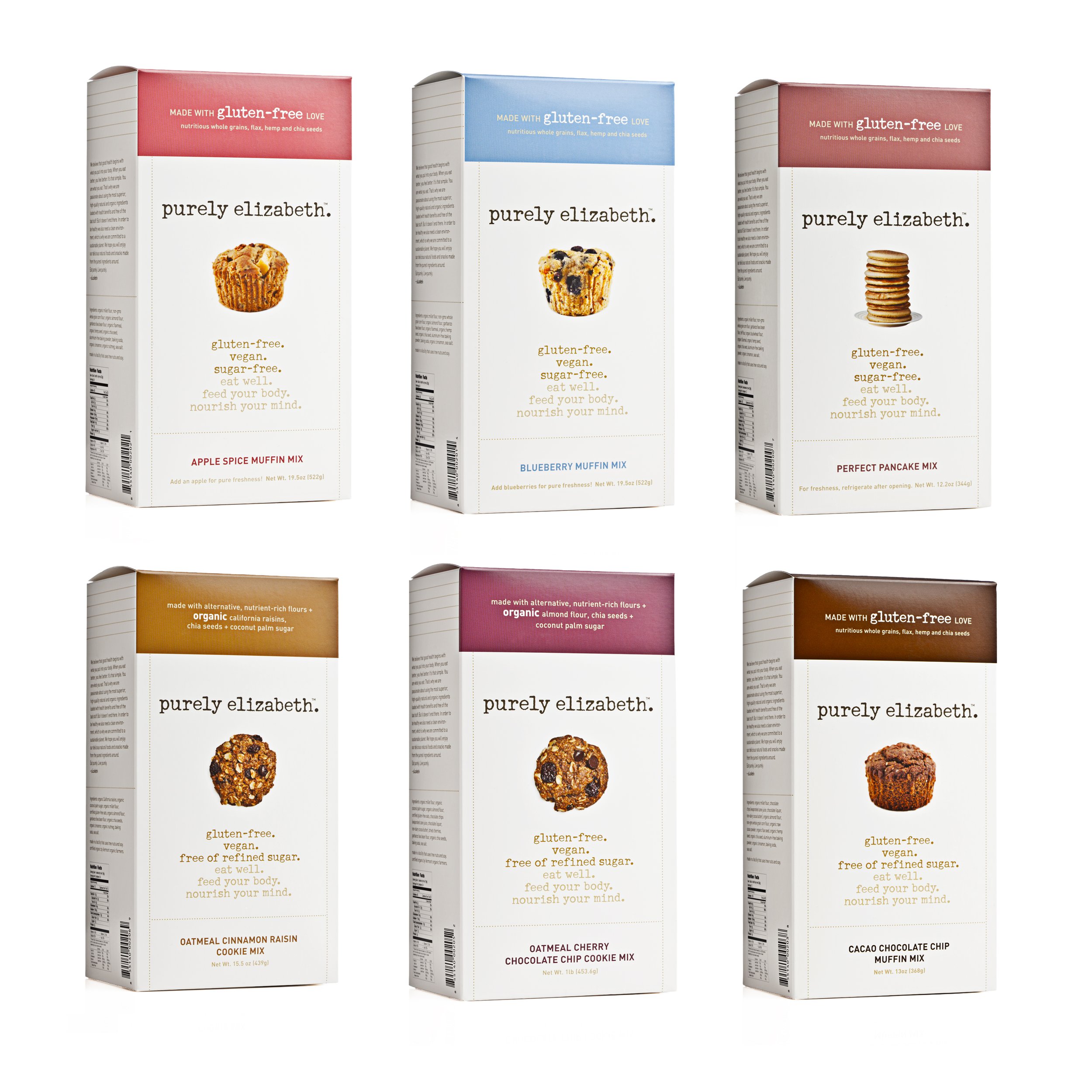
The switch to boxes
It doesn’t take a 2026 Fuji camera to show how the Purely Elizabeth boxes totally popped, standing out by far, next to the clutter of her competitors. Mission accomplished! This was taken in Whole Foods. I am grateful to Liz for her letting me really push the minimalism and the color blocks. It was fun, it was successful, and it was very exciting.
She wanted to try boxes… and they looked quite cool!
Fortunately, by this time we had engaged the fab photographer Stu Goldenberg for the product shots.
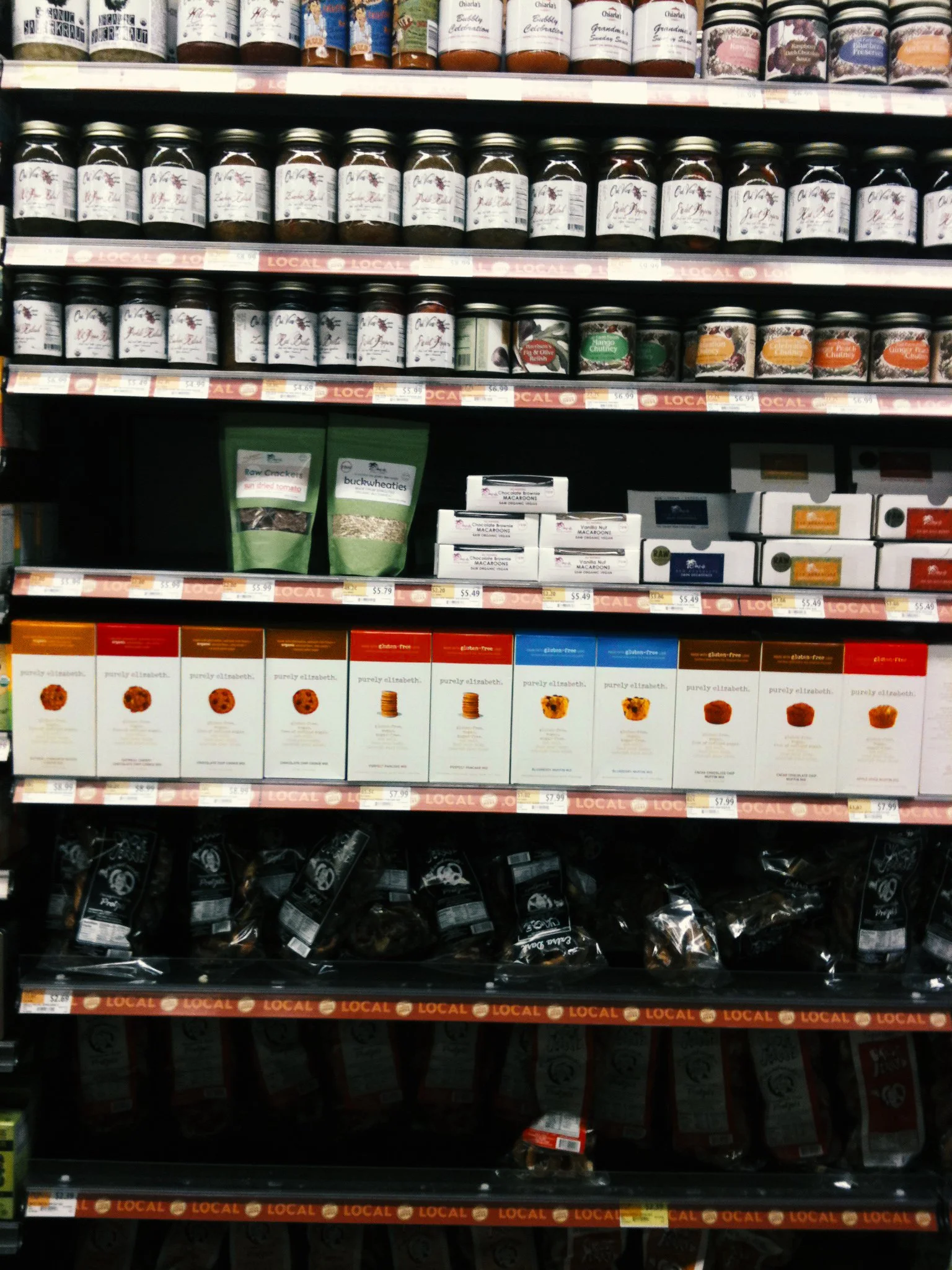
whole foods, 2011Photographed by me (on my phone)
January 2011
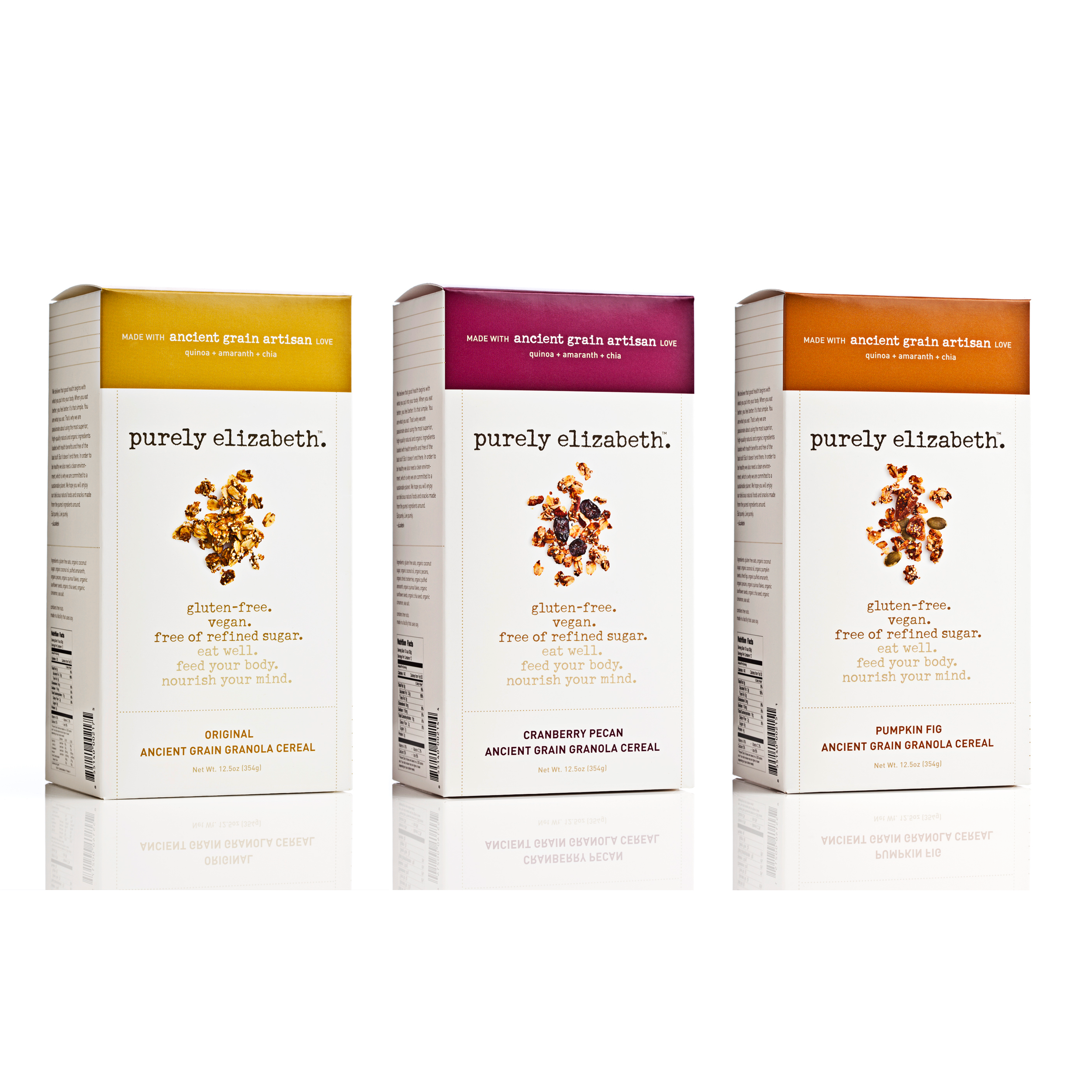
The granola is born!
And once again – the white space gave people room to breathe on shelves that were still cluttered with words.
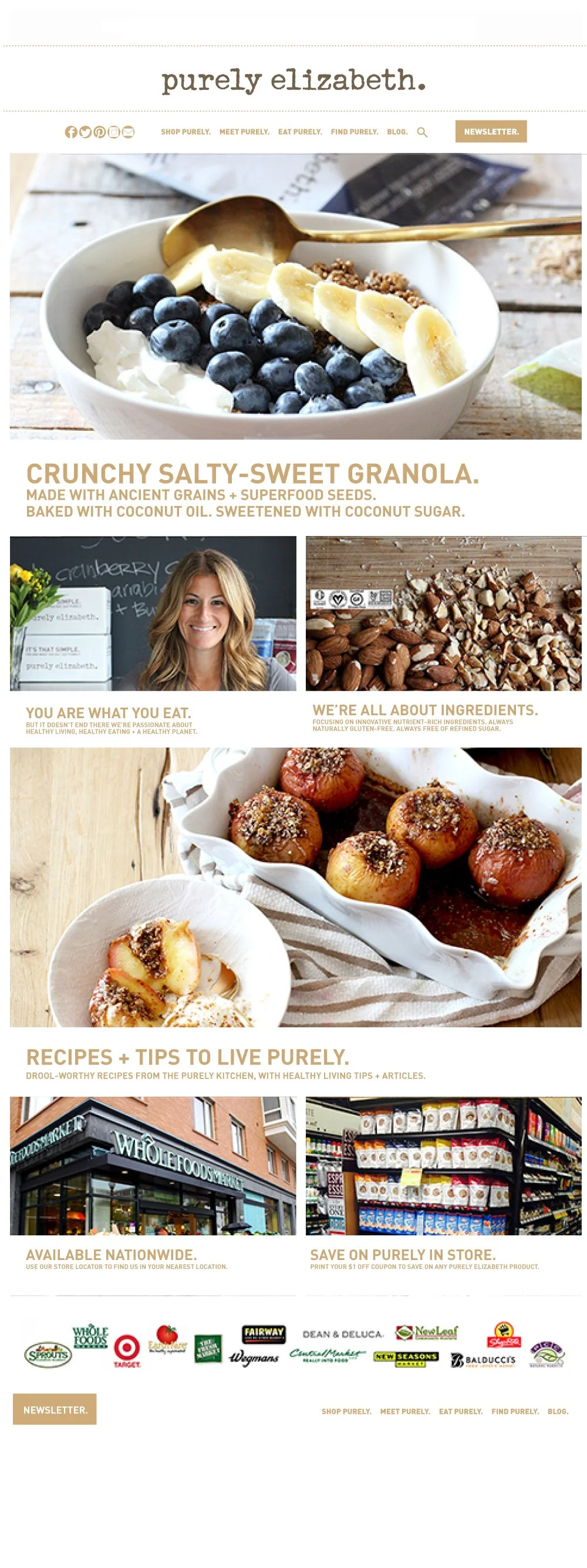
2012-2015
A TON of creative work
One day I’ll get to adding some more items that we had so much fun designing during those years, included but not limited to:
Website
Ads
Merch
Print Collateral
Tradeshow Booths
Granola Packaging
Granola Packaging – many spec changes, therefore many iterations
Muesli Packaging
Puffs Packaging
Oatmeal Packaging
Hot cereal Packaging
Granola Minis
Display Boxes
To-Go Cups Packaging
(several flavors for each)
I’m sure I’m forgetting things!
2015
Let’s try transparent windows, they suggested. As always, I obliged, and made sure the packaging maintained the same impact, allure, minimalism and color blocking as it always had - and has,
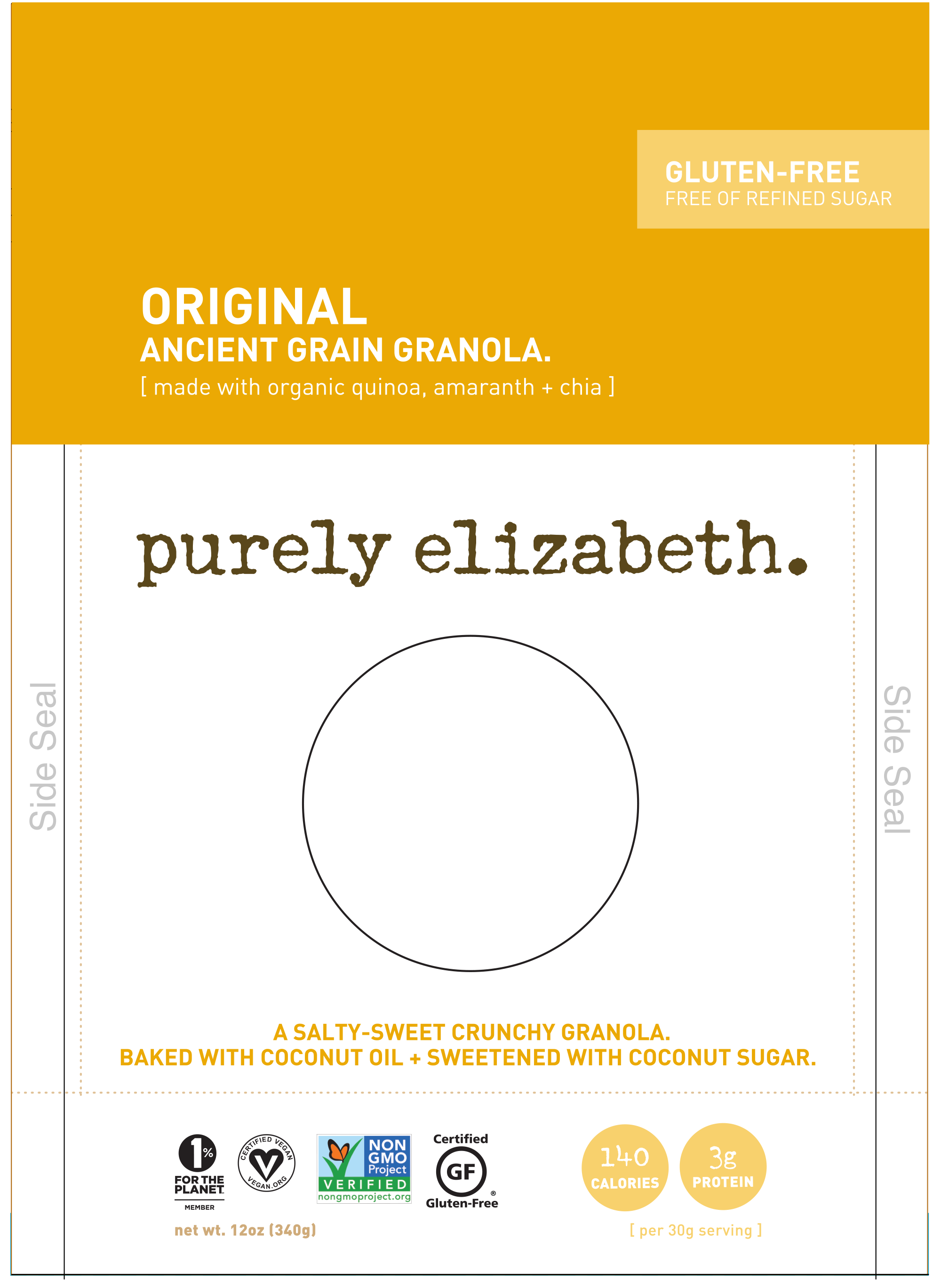
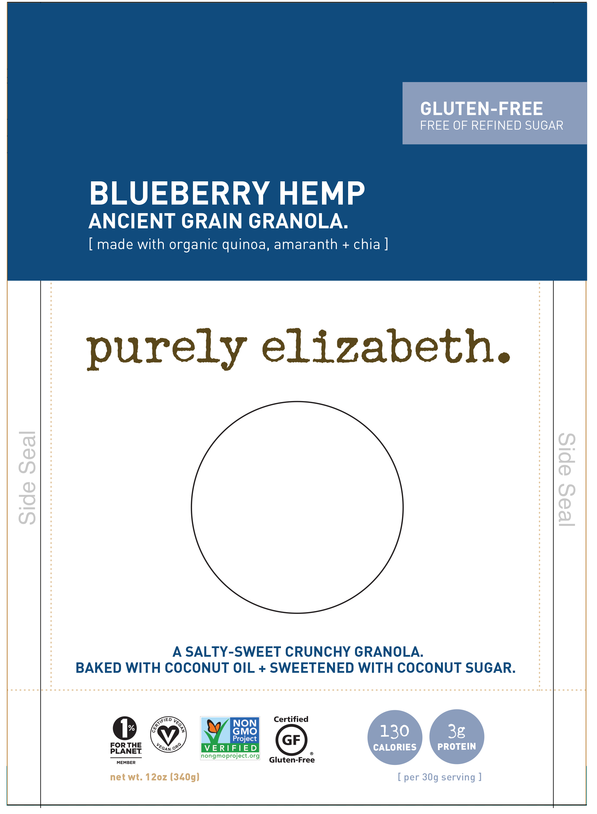

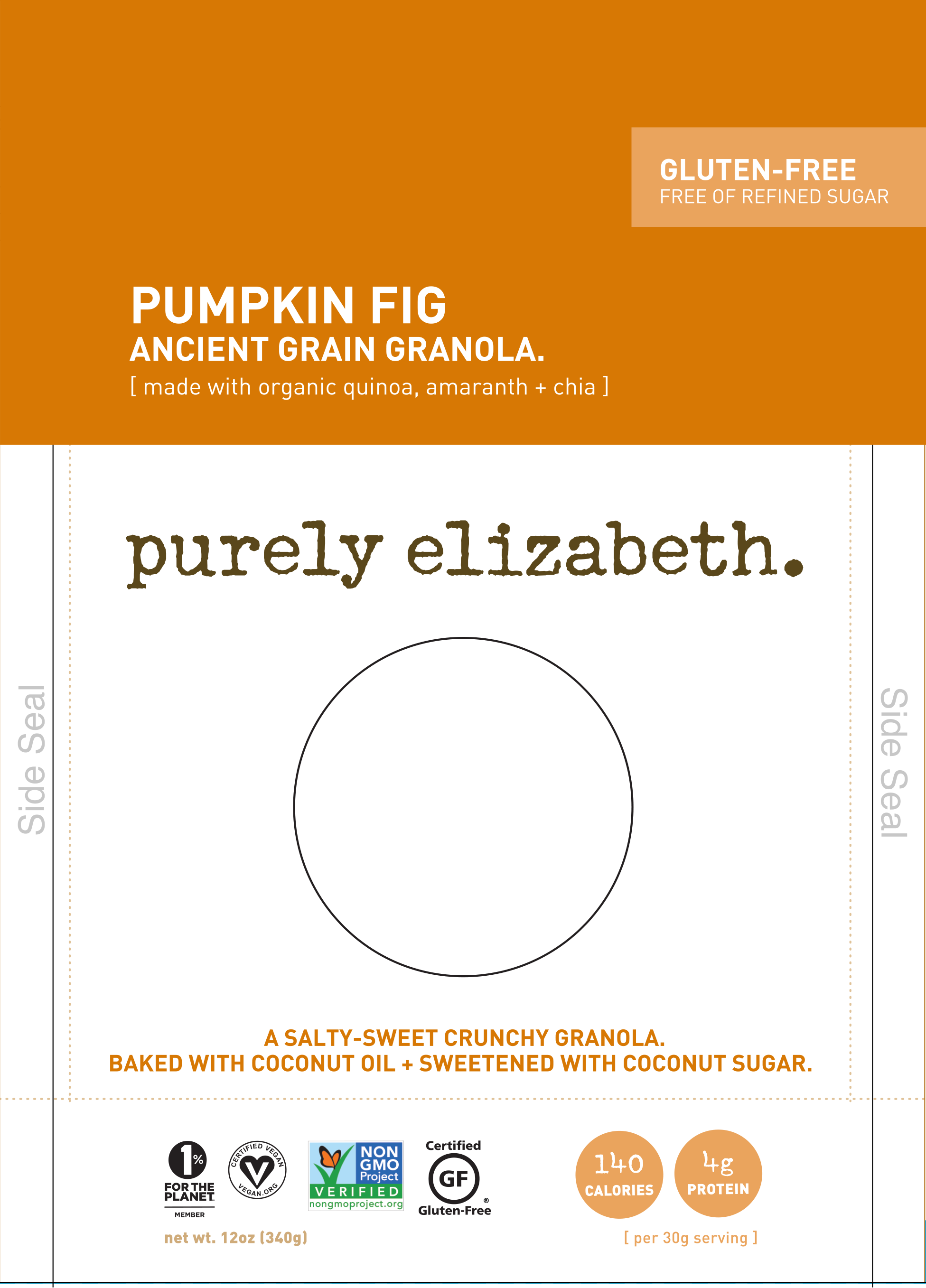
I am incredibly proud of the visual brand that I built for Liz, with Liz. Liz is brilliant, relentless, hardworking, strong — a beautiful person inside and out, and one of the most special people I have ever known. And she created an incredible product.
I just made sure people stopped long enough to find out what I already knew.
Good design helps businesses grow. Period.
More to come of the rest of the Purely Elizabeth brand, the entire DNA of which still stands today, all these years later – and just sold for $850 million.
Good design doesn't just work. It's what makes people look in the first place.
It is what sells –
before any product is tasted or tried.